whatever
User experience to interface design and frontend coding is done in-house
An organisation that needs to inform, educate and manage the expectations of its audience needs something better. The slow food movement translates perfectly to the world of web development: serve only what can be produced from scratch and only adopt new methods really serve the dining experience.
Websites are designed with custom components tailored to your needs. All coding and design is customised to fit your brand guidelines. There are no ready-made components that look sleek and bland as the millions of other sites built with the same component libraries.
The other end of the spectrum is the equivalent of fast food: ready-made templates, filled in by a designer. THere’s also the online services offering automated and customisable solutions. It’s the default starting position where you get your feet wet and learn the ropes of administering a web presence and how it can profit your work. Do you want to invest the time and effort to self-learn and go through all the mistakes everybody invariably goes through?
Design proposal for mobile-first website
Design extends brand and built according to client brief


There are many ways of slicing and dicing the key requirements for a web project. The biggest requirement that needs to be answered is the life-span of the project. A landing page for a marketing campaign is short lived and has few concerns beyond reaching an audience and getting conversions. At the other end of the scale, a client-facing portal that provides easy access to specialist information is a long-term project that should be addressed with the same concern as other infrastructure.
Some old work for nostalgia’s sake
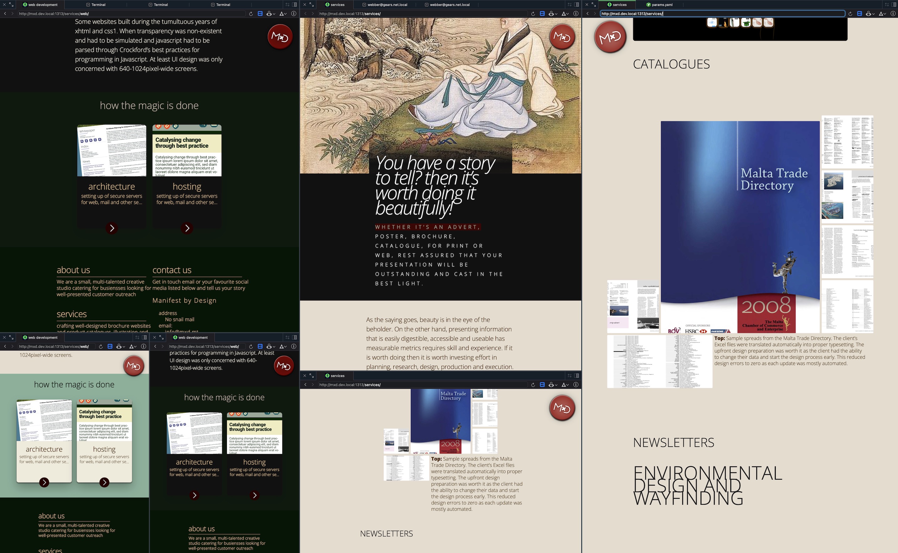
The discipline has been going through continuous technical upheavals since the start, way back in 1993. At first it was myriad compatibility problems between browsers, each introducing their own way of describing a web document. Followed by a decade of standardisation hell where designers had to suffer yearly changes to specs in html, css or javascript and the slow uptake by various browsers. These problems were catalogued and documented painstakingly by brave people like Paul Irish or Peter-Paul Koch at quircksmode.org and shared for the rest of us. Hardware hasn’t stayed idle either, the sudden explosion of screen sizes and accessibility requirements have made this discipline into a technical hell that is hard to understand from the outside.

Top: Old-school no longer cuts it but if it is crafted according to best-practice, then odds are it will still work with minimal changes.
Some websites built during the tumultuous years of xhtml and css1. When transparency was non-existent and had to be simulated and javascript had to be parsed through Crockford’s best practices for programming in Javascript. At least UI design was only concerned with 640-1024pixel-wide screens.